Introduction
Acura, the luxury vehicle division of Honda, is one of the most recognizable automotive brands in the world. Established in 1986, Acura has built a reputation for innovation, performance, and precision engineering. A crucial part of its identity is its logo, which represents the brand’s philosophy and heritage. The Acura logo is not just a simple emblem; it carries deep symbolism and has evolved over the years to reflect the company’s growth and vision.
In this article, we will explore the origins, meaning, and evolution of the Acura logo, along with its impact on branding and consumer perception.
Origins of Acura and Its Logo
Acura was launched by Honda in 1986 as its luxury vehicle brand, marking Honda’s entry into the high-end automobile market. The goal was to compete with European luxury car manufacturers such as BMW, Mercedes-Benz, and Audi. Acura debuted with two models, the Legend and the Integra, which quickly gained popularity for their reliability and performance.
When Acura was founded, its branding needed to distinguish itself from Honda while maintaining a connection to its parent company’s values of precision and technological excellence. This led to the development of a distinctive logo that would encapsulate Acura’s identity.
Meaning Behind the Acura Logo
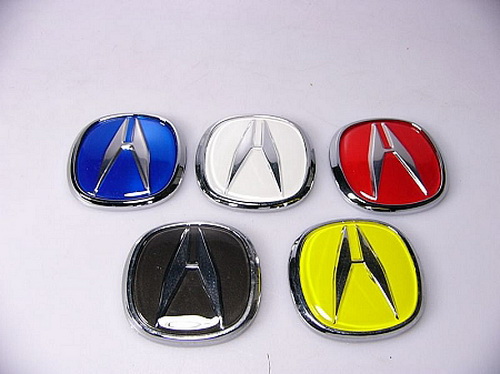
The Acura logo features a stylized “A” enclosed within an oval shape. However, upon closer examination, the design is more than just an initial. The emblem is actually a pair of calipers, a precision measuring tool used in engineering and manufacturing. This symbol aligns with Acura’s core philosophy of precision engineering, high performance, and advanced technology.
Symbolism of the Acura Logo
- Caliper Symbolism: The calipers represent accuracy, attention to detail, and the pursuit of perfection. This reflects Acura’s commitment to engineering vehicles with superior performance, safety, and luxury.
- Letter “A” Representation: While the logo visually resembles an “A,” which stands for Acura, it also subtly implies “Advance” and “Accuracy,” two values that Acura holds dear.
- Oval Enclosure: The oval shape surrounding the emblem represents unity, wholeness, and continuity, signifying Acura’s vision for a future of continuous innovation.
Evolution of the Acura Logo
Since its introduction in 1986, the Acura logo has undergone subtle refinements to enhance its visual appeal while maintaining its original symbolism.

1986-1989: The Initial Logo
The earliest version of the Acura logo was a simple wordmark featuring the brand’s name in an elegant font. This minimalistic approach was common among automotive brands at the time, emphasizing a clean and premium image. However, Acura needed a stronger visual identity, leading to the introduction of the now-iconic caliper emblem.
1990-Present: The Modern Logo
In 1990, Acura introduced the emblem we recognize today. The caliper design, enclosed in an oval, became the official symbol of the brand. Over the years, the logo has been slightly refined in terms of proportions and shading, but the fundamental design has remained unchanged.
The logo appears on all Acura vehicles, key fobs, marketing materials, and dealerships, reinforcing brand recognition.
Acura’s Logo in Branding and Marketing
Acura’s logo plays a vital role in its branding and marketing efforts. It is prominently featured in advertisements, sponsorships, and digital media campaigns. The emblem conveys a sense of prestige, reinforcing Acura’s position as a luxury automobile manufacturer.
Consistency in Branding
One of the reasons Acura’s logo has remained effective over the decades is its consistency. While many brands undergo frequent rebranding efforts, Acura has maintained the integrity of its logo, allowing it to build strong brand recognition.
Influence on Consumer Perception
Luxury car buyers often associate a brand’s logo with its reputation. Acura’s emblem, with its precision-driven symbolism, appeals to consumers who value engineering excellence and innovation. The caliper design distinguishes Acura from other luxury brands, giving it a unique identity in the market.
Comparison with Other Automotive Logos
When comparing the Acura logo to other luxury automotive brands, its uniqueness becomes even more apparent:
- Mercedes-Benz: Features a three-pointed star, symbolizing dominance over land, sea, and air.
- BMW: Represents a rotating airplane propeller, reflecting its aviation history.
- Audi: Uses four rings to symbolize the merger of four automobile manufacturers.
- Lexus: Features a stylized “L” inside an oval, emphasizing elegance and refinement.
Unlike these brands, Acura’s logo focuses on precision engineering rather than heritage or power, making it distinct among luxury automakers.
Future of the Acura Logo
As Acura continues to innovate with new technologies, including hybrid and electric vehicles, there is always the possibility that the logo may see further refinements. However, given the strong recognition and symbolism behind the current design, it is unlikely that Acura will make drastic changes.
In recent years, the logo has been modernized slightly with chrome finishes and 3D effects to align with contemporary design trends. Future iterations may incorporate digital enhancements for electric and autonomous vehicle branding.
Conclusion
The Acura logo is a powerful symbol that encapsulates the brand’s core values of precision, innovation, and excellence. From its origins as a simple wordmark to its evolution into a sleek caliper design, the emblem has remained an essential part of Acura’s identity.
By maintaining a strong and consistent visual identity, Acura has successfully positioned itself as a leading luxury automotive brand. As the company continues to push technological boundaries, its logo will remain a lasting symbol of precision and performance in the automotive industry.


